|
|
Post by kungfuzu on Jul 9, 2024 8:44:53 GMT -8
As I recall, it had something to do with sharp images.
P.S. I just checked the Wiki and it confirmed this.
Type metal is a good partial summation of my business career. I dealt in a lot of tin, lead and antimony for some time.  |
|
Brad Nelson
Administrator
עַבְדְּךָ֔ אֶת־ הַתְּשׁוּעָ֥ה הַגְּדֹלָ֖ה הַזֹּ֑את
Posts: 12,236
|
Post by Brad Nelson on Jul 10, 2024 7:46:35 GMT -8
The terminology of typography has changed over recent years. Mainly that is found in the "font vs. typeface" debate.
Let's lay out the terms as they were before digital type:
Typeface Family (which denotes the entire group)
Helvetica regular
Helvetica bold
Helvetica italic
Helvetica bold italic.
Typeface (only one element of the above group)
Helvetica italic
Font (only one typeface in one particular size):
12 pt. Helvetica bold
Because type was originally cast in metal, it would be cast at a particular size, thus the relevance of "font" in the terminology. Digital type, of course, needs no reference to "font" because it can be output at about any size you need...often in 1/10 point increments. (72 points in an inch, 12 points in a pica, 6 picas to an inch)
Today, "font" can mean "typeface" or "typeface family." There is apparently also "official" terminology that uses "font family" as a synonym of "typeface family" to further confuse the issue.
To further confuse the issue further, Google has inserted their own definition:
Confused yet? I guess (and I'm not quite sure) that Google is saying that the digital file where the typeface data is stored is the "font" while the expression of this data on the screen or paper is the "typeface." If I'm wrong, well, god help those who don't have even a cursory background in typography.
So, as daddy said (or should have said), "Ignore anything Google says because they're a bunch of arrogant, woke, tech oligarchs who would swallow you whole if there was money in it (and there is, and they do)".
But point taken about the font menus leading to the munging of the terms "typeface" and "font." It is what it is now, and now "font" and "typeface" mean the same thing, although no one knows for sure (even me) if "font" also means "font family" (the latter being the supposed equivalent of "typeface family"). Does it matter? I'm not sure. But that's some of the background on all this.
No wonder that finding word origins can be so difficult. Here we can kind of track a change that has occurred in the last twenty years. And it's reasonably to assume that in 100 years it could be difficult to nail down these changed meanings.
|
|
|
|
Post by kungfuzu on Jul 10, 2024 9:39:24 GMT -8
Being a book fanatic, I find different types interesting and sometimes like to look into their history. Just about everything has a story, as people rarely do things for no reason. I like reading about these reasons.
Some of the types used today go back to the early days of printing i.e. the late 15th, early 16th centuries. I find it interesting that a good number of types originated in Basel, including Helvetica.
I don't much like the word "font" for printing as it makes me think of this. |
|
Brad Nelson
Administrator
עַבְדְּךָ֔ אֶת־ הַתְּשׁוּעָ֥ה הַגְּדֹלָ֖ה הַזֹּ֑את
Posts: 12,236
|
Post by Brad Nelson on Jul 10, 2024 11:13:19 GMT -8
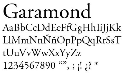
That's another good kind of font. As for old typefaces, Claude Garamond is renowned for capturing the old styles and formalizing them into typefaces, although this Britannica article said some were misattributed to him.  |
|
|
|
Post by kungfuzu on Jul 10, 2024 18:57:55 GMT -8
I have run across him a few times over the years. I believe Will Durant may have mentioned him. And I am sure that he was mentioned in the Cambridge histories which I have read.
Such men were extremely talented. They generally spoke Latin and/or Greek as well as their native tongues. The were skilled technicians and metallurgists. They searched for new ways to bring the written word to paper.
|
|
Brad Nelson
Administrator
עַבְדְּךָ֔ אֶת־ הַתְּשׁוּעָ֥ה הַגְּדֹלָ֖ה הַזֹּ֑את
Posts: 12,236
|
Post by Brad Nelson on Jul 11, 2024 8:11:37 GMT -8
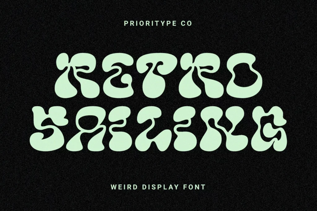
It's funny, Mr. Kung. I certainly don't consider myself an artiste. I've known some and worked with them. I'm a jack-of-all-trades, master of none...and mediocre in many of them. But it's funny to watch one's own aesthetic development. Back in the day of using phototypesetters and press type dry transfer lettering (Letraset, Prestype, and Chartpak were the big-three), we used and experimented with all kinds of wild typefaces, particular for display or headline type.  That's not all bad. For a circus poster, for instance, that is appropriate. But because we had easy access to all kinds of typefaces, we (probably more "I") would often misuse them. Some restraint was needed. Now I'm more of the school of "Helvetica for headlines, Times or Garamond for body text." And this restraint can give a much more refined look. But by all means be goofy and experiment with type. You can find all kinds of free fonts online and I frequently make use of them for specific purposes. And some of them are pretty wild. But used sparingly, they can really work. One can thus have more respect for, and appreciation of, a Claude Garamond when one has been dancing with Bozo the Clown.   |
|
|
|
Post by kungfuzu on Jul 11, 2024 10:28:13 GMT -8
That makes me think of things like this, which I had.
While looking through psychedelic posters from the 1960's, I ran across this.
I bought one of these when I was in my teens. I might still have it somewhere in storage.
|
|
Brad Nelson
Administrator
עַבְדְּךָ֔ אֶת־ הַתְּשׁוּעָ֥ה הַגְּדֹלָ֖ה הַזֹּ֑את
Posts: 12,236
|
Post by Brad Nelson on Jul 11, 2024 10:50:03 GMT -8
I'm pretty sure that Bryan, the Younger, had one of those boxes. I'm going to show him that when he comes in. And if one were to delve deep into internet free fonts, I would not be at all surprised of someone did an entire typeface based on that Cream album cover. A cursory search, however, turned up nothing. But I did find this that names three typefaces used on their album covers. More typefaces used in band names here. |
|