|
|
Post by timothylane on Jan 30, 2020 15:13:30 GMT -8
Well, Olive Oyl I get. I don't know who the other two are.
|
|
|
|
Post by kungfuzu on Jan 30, 2020 21:21:34 GMT -8
Laurence Olivier and Olivia Walton (Michael Learned)
I thought the Olivetti particularly good as it got the Olive in there and alluded to the fact that Boris Johnson was a journalist/columnist/newspaper editor.
|
|
|
|
Post by timothylane on Jan 30, 2020 21:59:28 GMT -8
That was Laurence Olivier? At what age?
Incidentally, at one of the SH/ACD symposia we used to go to, there was a presentation on the early days of Thimble Theater. Popeye actually came in as a replacement for a Great Detective hired by Olive Oyl for some task (keeping watch on a scapegrace brother, Castor Oyl). The detective was naturally something of a Holmes parody, hence the connection.
|
|
|
|
Post by kungfuzu on Jan 30, 2020 22:39:16 GMT -8
Young.
I guess he is in his twenties.
|
|
Brad Nelson
Administrator
עַבְדְּךָ֔ אֶת־ הַתְּשׁוּעָ֥ה הַגְּדֹלָ֖ה הַזֹּ֑את
Posts: 12,271
|
Post by Brad Nelson on Jan 31, 2020 8:30:43 GMT -8
|
|
Brad Nelson
Administrator
עַבְדְּךָ֔ אֶת־ הַתְּשׁוּעָ֥ה הַגְּדֹלָ֖ה הַזֹּ֑את
Posts: 12,271
|
Post by Brad Nelson on Jan 31, 2020 8:32:09 GMT -8
Extra credit for this olive, although I think Mr. Kung or Gibbnonymous would get it immediately:  |
|
Brad Nelson
Administrator
עַבְדְּךָ֔ אֶת־ הַתְּשׁוּעָ֥ה הַגְּדֹלָ֖ה הַזֹּ֑את
Posts: 12,271
|
Post by Brad Nelson on Jan 31, 2020 8:33:03 GMT -8
We'll make this one easy for Timothy:  |
|
Brad Nelson
Administrator
עַבְדְּךָ֔ אֶת־ הַתְּשׁוּעָ֥ה הַגְּדֹלָ֖ה הַזֹּ֑את
Posts: 12,271
|
Post by Brad Nelson on Jan 31, 2020 8:37:32 GMT -8
This is Final Jeopardy level. The category is “Anagram”:  |
|
Brad Nelson
Administrator
עַבְדְּךָ֔ אֶת־ הַתְּשׁוּעָ֥ה הַגְּדֹלָ֖ה הַזֹּ֑את
Posts: 12,271
|
Post by Brad Nelson on Jan 31, 2020 8:40:53 GMT -8
|
|
|
|
Post by kungfuzu on Jan 31, 2020 8:47:56 GMT -8
"Material favored by many Indian matrons for making saris." That took me a couple of minutes so I am glad I didn't bet the farm on it. "Voile."
I loved the second Olivia in "Romeo & Juliet" which our 10th grade English teacher took us to see.
I was always of two minds about the first Olivia's role in "Gone With The Wind."
|
|
|
|
Post by kungfuzu on Jan 31, 2020 8:49:12 GMT -8
|
|
Brad Nelson
Administrator
עַבְדְּךָ֔ אֶת־ הַתְּשׁוּעָ֥ה הַגְּדֹלָ֖ה הַזֹּ֑את
Posts: 12,271
|
Post by Brad Nelson on Jan 31, 2020 8:49:34 GMT -8
|
|
Brad Nelson
Administrator
עַבְדְּךָ֔ אֶת־ הַתְּשׁוּעָ֥ה הַגְּדֹלָ֖ה הַזֹּ֑את
Posts: 12,271
|
Post by Brad Nelson on Jan 31, 2020 8:49:59 GMT -8
If the photos are right, both.
|
|
|
|
Post by kungfuzu on Jan 31, 2020 8:51:09 GMT -8
OK, the second photo just answered my question. As one would expect, the first is Sr. and the mustache is Jr.
|
|
Brad Nelson
Administrator
עַבְדְּךָ֔ אֶת־ הַתְּשׁוּעָ֥ה הַגְּדֹלָ֖ה הַזֹּ֑את
Posts: 12,271
|
Post by Brad Nelson on Jan 31, 2020 8:53:07 GMT -8
They certainly do look a lot alike. And I fixed the one quote for Sr. I like the one about science.
|
|
Brad Nelson
Administrator
עַבְדְּךָ֔ אֶת־ הַתְּשׁוּעָ֥ה הַגְּדֹלָ֖ה הַזֹּ֑את
Posts: 12,271
|
Post by Brad Nelson on Jan 31, 2020 8:54:04 GMT -8
Wow, Mr. Kung. I was figuring we'd have to wait for Gibbnonymous to get the Final Jeopardy answer. Well done.
|
|
Brad Nelson
Administrator
עַבְדְּךָ֔ אֶת־ הַתְּשׁוּעָ֥ה הַגְּדֹלָ֖ה הַזֹּ֑את
Posts: 12,271
|
Post by Brad Nelson on Jan 31, 2020 8:55:30 GMT -8
Was your two-minds regarding the appropriateness of a saintly character in that novel/movie or her portrayal of such?
|
|
|
|
Post by kungfuzu on Jan 31, 2020 9:01:34 GMT -8
To begin with, I found the character somewhat unbelievable. Could anyone be so obtuse? But in some ways Olivia's portrayal was also irritating. Sometimes I wanted to slap her and say, "wake up, woman."
|
|
Brad Nelson
Administrator
עַבְדְּךָ֔ אֶת־ הַתְּשׁוּעָ֥ה הַגְּדֹלָ֖ה הַזֹּ֑את
Posts: 12,271
|
Post by Brad Nelson on Jan 31, 2020 9:18:22 GMT -8
Okay, that makes sense. She was indeed obtuse. She was looking at things through very rose-tinted lenses. One might even say that her character acted as a McGuffin….it was just there to move the plot along or to try to add contrast to Scarlett’s character.
However, I’m going to side with Margaret Mitchell on this. The older I get the more I realize that most people live in a little bubble of delusion, at least to some extent.
In the case of Melanie, she was touched with the grace of a generous and forgiving nature. Her love for Scarlett clearly is coming from a more Cosmic perspective.
Such people are exceedingly rare. And because they are so beyond the normal, it is also normal to view them as fake or out of place. And, of course, saints are indeed out of place in this world.
|
|
Brad Nelson
Administrator
עַבְדְּךָ֔ אֶת־ הַתְּשׁוּעָ֥ה הַגְּדֹלָ֖ה הַזֹּ֑את
Posts: 12,271
|
Post by Brad Nelson on Jan 31, 2020 9:23:20 GMT -8
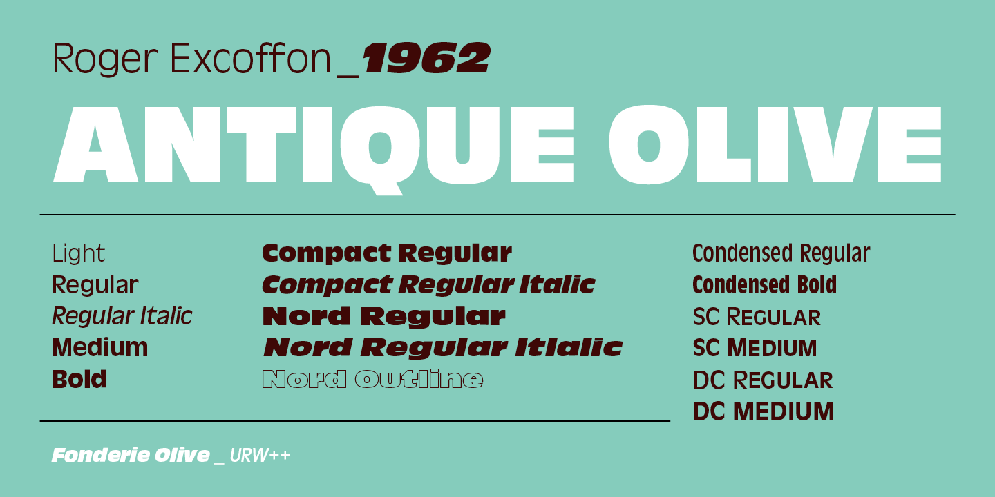
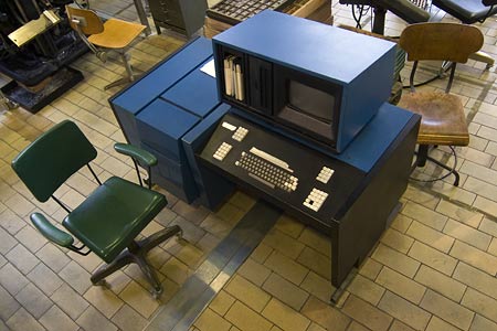
It wouldn't be fair to post a typeface and expect anyone but an expert to get it. But when I first got into the business, the CompuWriter IV in the shop had this typeface as one of the filmstrips you could load into it.   An enlarged view of part of the keyboard. These were typesetters. You would load a filmstrip that had about 8 “fonts” on it. The strip was about 3-1/2” x 24”. It wrapped around a disk inside the machine. You would also load your choice of light-sensitive receiving material. This was a plastic cartridge with a roll of light-sensitive paper inside. Cartridge widths ranged from about 3” to 12”. This paper cost money, so you would in theory use only the size you would need. Each line (a single line of text) was exposed when you basically hit “return” and then you moved onto the other line. You would eventually have a long strip of black-and-white characters on a white sheet of paper after you developed it in a small machine. You would then put wax on the back of the paper and then “paste-up” your text, likely along with other photographs and graphic elements on a pice of white pasteboard. If you found a typo in your work (which might be several paragraphs of text), you would most likely not reset the entire thing but reset one line and the paste that over the top. Suffice it to say, this could be difficult to do and make look good. What people do (including graphic designers) with text today is basically accept the output from the software in regards to how text appears. And good software will allow you a myriad of settings. Really good software might not require you to fuss with it much. But mostly these days graphic designers learn next to nothing about the various aspects of text, especially how to make it look good. Many probably have no idea what those optional setting for text are. Believe me. I see the results all the time. With the CompuWriter IV, you had completely control over all aspects. It was as much a process of programming a computer as it was typing at a keyboard. And this thing was indeed a complex (for the time) computer. It was very easy to open up and look inside. This thing must have had several hundred chips, and a dozen or so small circuit boards in it. Later, I did gain some experience on an EditWriter which allowed you to compose the text more like a world process on a multi-line screen. You could save files, etc.. Most importantly, you moved beyond the “expose one line at a time” as with the CompuWriter IV which also had no means to store text on disk as with the EditWriter.  Why did I put quotation marks around the word, “font,” above? It’s because “font” is not actually synonymous with “typeface.” A “font,” very technically speaking meant: 12 point Helvetica Italics. Another “font” would be 12 point Helvetica Italic. A different font would be 12 point Helvetica Regular. Another would be 8 point Times Bold. Etc. “Type Family” is now what we typically mean by “font.” I want, say, Times instead of Arial. These distinctions matter less today because they can matter less. But in the old days, you might have a filmstrip with Helvetica Regular, Helvetica Bold, Helvetica Condensed, and a couple other fonts. If memory serves, there were only 8 to a strip. Things were usually organized in a convenient way. But you could certainly find it possible that for some more obscure typeface, you might have to load a different filmstrip if you wanted the italic version of the typeface. This is more than you wanted to know. And I’ve forgotten so much more.
|
|